The Oddity newspaper
About The Oddity
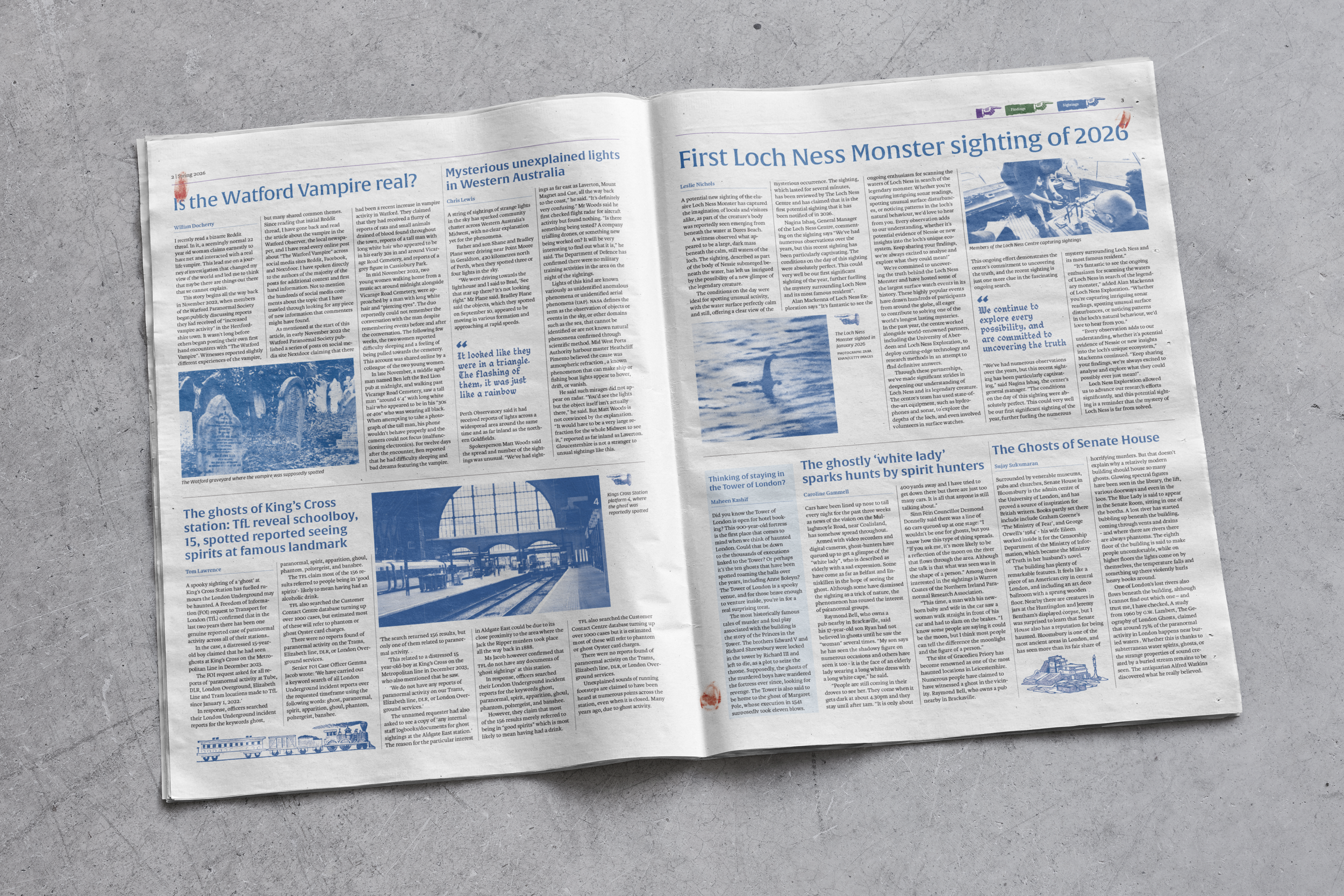
The Oddity is a newspaper aimed towards people interested in bizarre. It covers three main sections: haunted places, sightings, and and findings. The Oddity is handed out at Paracon, a quarterly convention that brings together fans and sceptics of the paranormal.
Typography
The Oddity uses Alverata in different weights for headings depending on the size. It is legible at multiple different sizes, including body text, which is why it is utilised for captions too.
Pull quotes are set in CC Goth Chic. This is a more modern take on blackletter typefaces, avoiding the newspaper looking too gimmicky whilst still building on the atmosphere that The Oddity aims to evoke.
Body text is set in Karmina, which is suitable for multiple different printing conditions. The combination of these typefaces aim to curate an appropriate personality, targeting readers with interest in the paranormal.
Colour
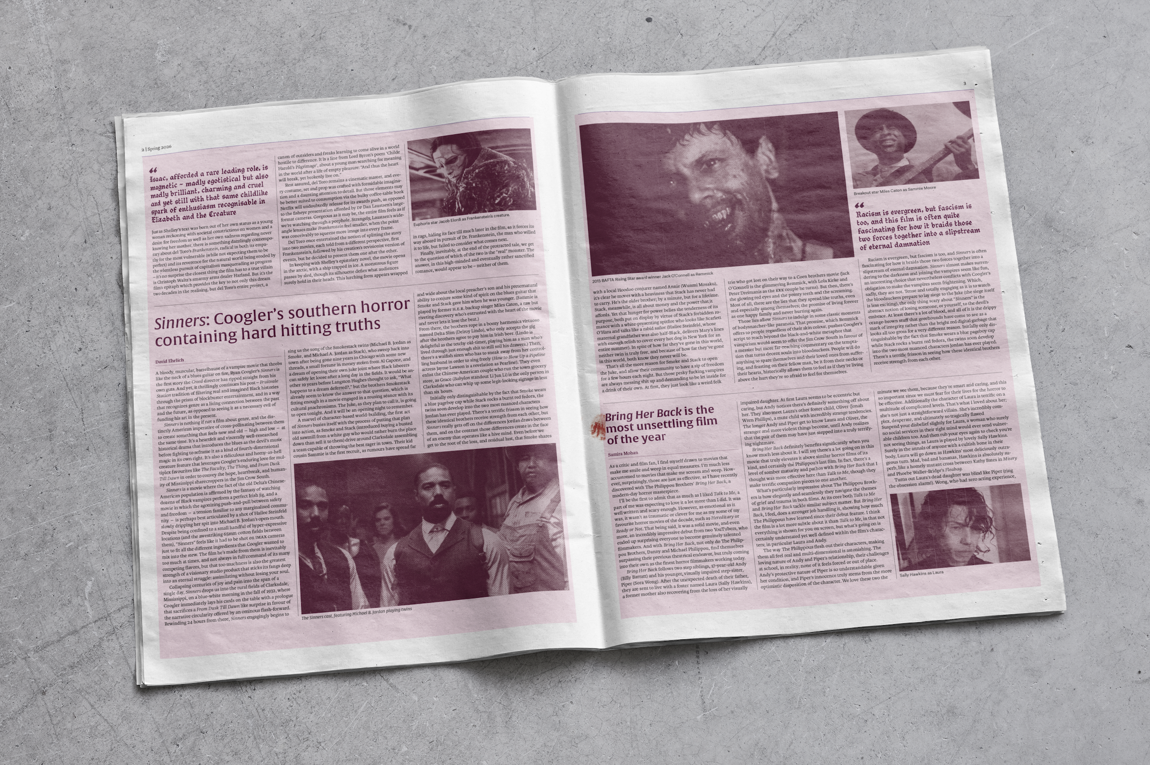
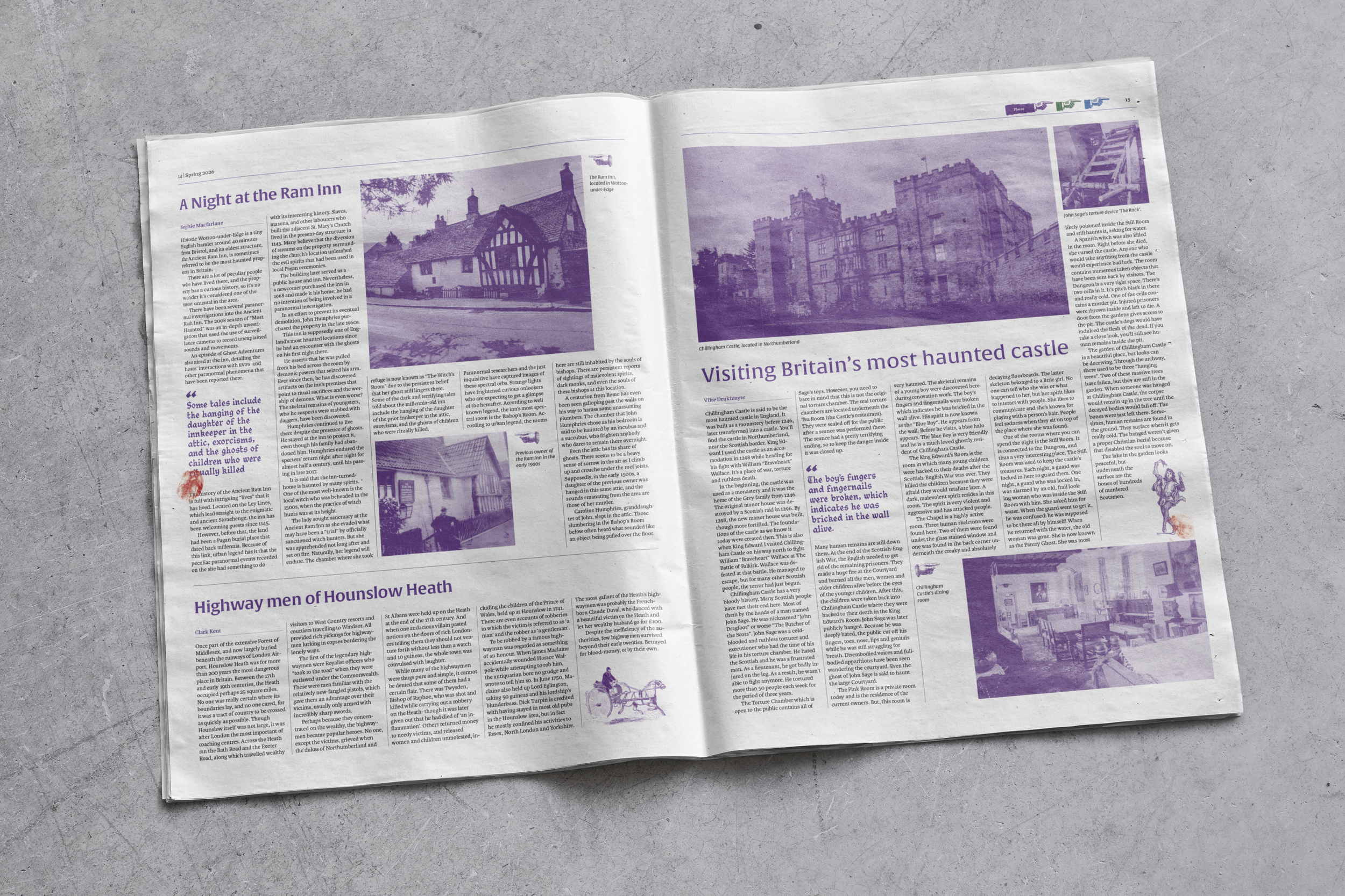
The Oddity uses three colours for its three sections. Purple for haunted places, green for findings, and blue for sightings. These are popular topics of interest amongst the paranormal community.
Overall, sticking to these colours helps create a sense cohesion throughout the newspaper. The use of these dark, moody colours help establish the personality of The Oddity.
Imagery
Images that accompany each article are halfoned through Photoshop. This fits into the grunge and eerie atmosphere of the newspaper whilst appealing to aesthetics that my audience tend
to like.
Ornamentation is a big part of establishing the personality of The Oddity. Relevant ornaments should be used across articles to help with story building, rather than just decoration.