Selected Scenes from the End of the World redesign
About the album
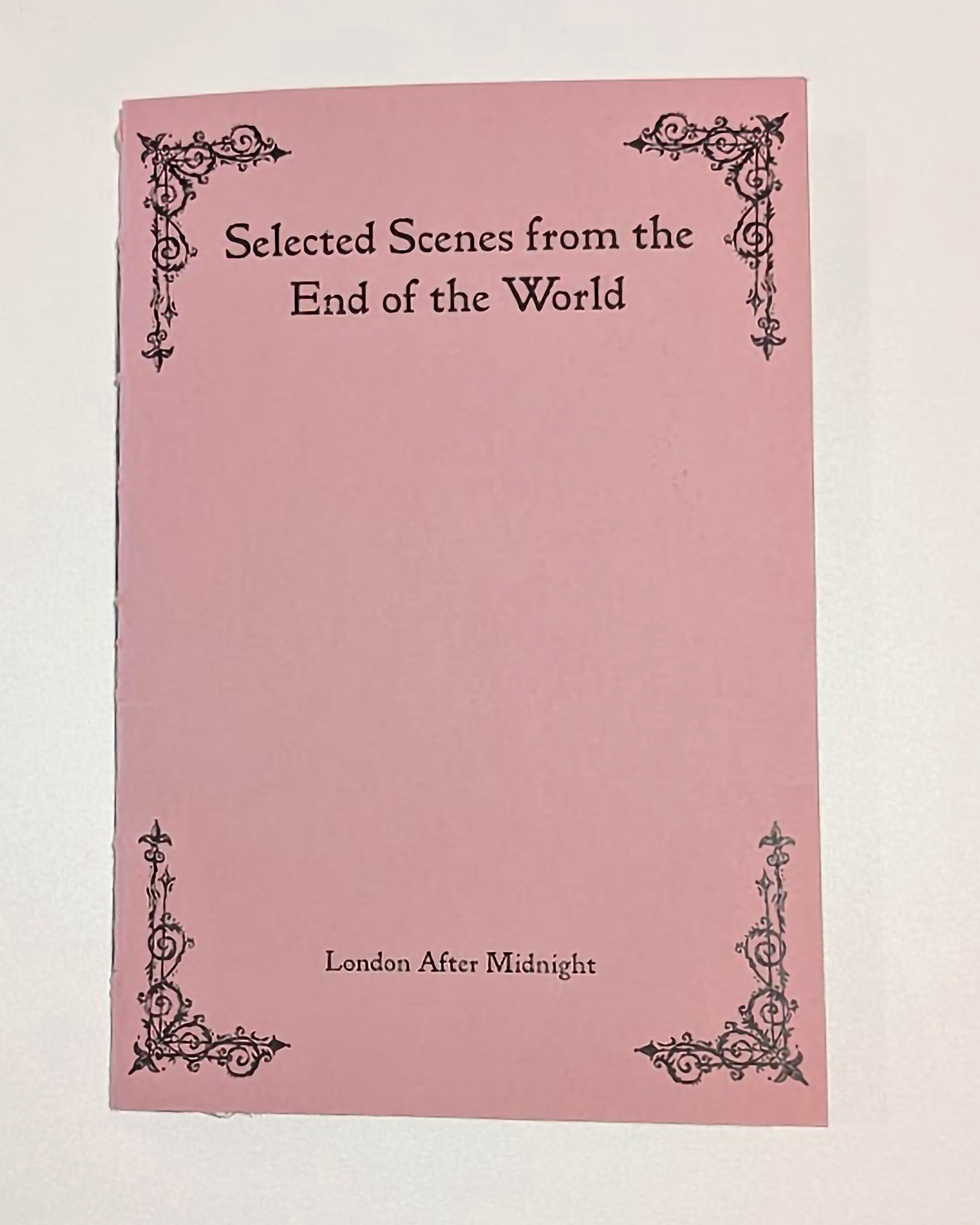
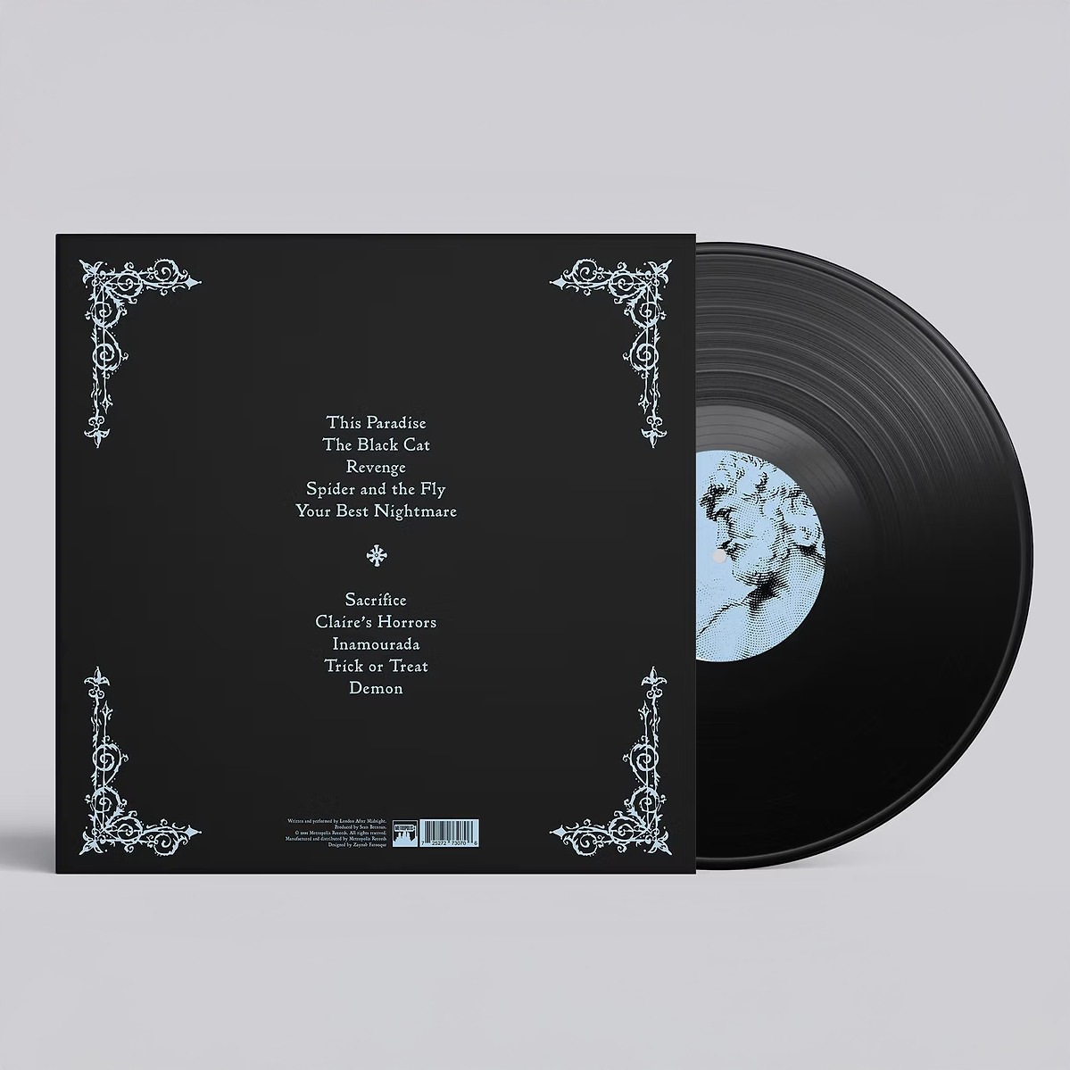
The album I chose to redesign as apart of a university re-packaging module is Selected Scenes from the End of the World by London After Midnight. It is a gothic rock album released in 1991. I chose to redesign this vinyl record as the current covers are really weak, especially in contrast with the meaning of the songs. The typography is not effective and is not really representative of the gothic rock genre, along with the imagery. The design could be elevated to be more representative of the genre and the album itself. Along with the vinyl record cover and inner sleeve, I designed a lyric book, cassette tape, and tour poster.
Typography
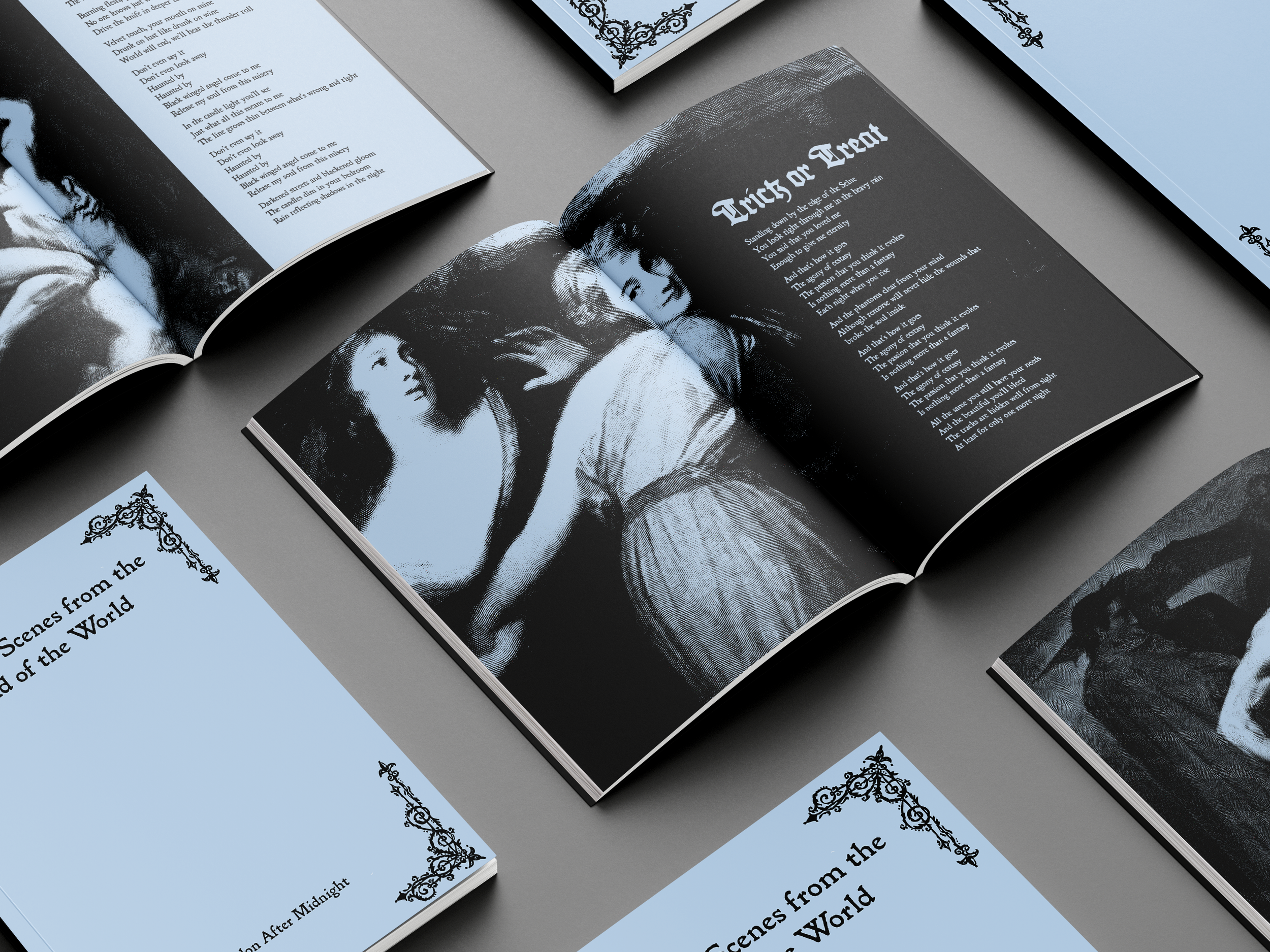
In an attempt to move away from cliche blackletter typefaces, I used Blackbeard. This typeface provides an expression of decay and distress without relying on predictable typefaces that are used for albums of this genre. Blackletter is only used for the titles of the songs in the lyric book in order to create a sense of hierarchy through typographic differentiation between the title and the lyrics.
Colour
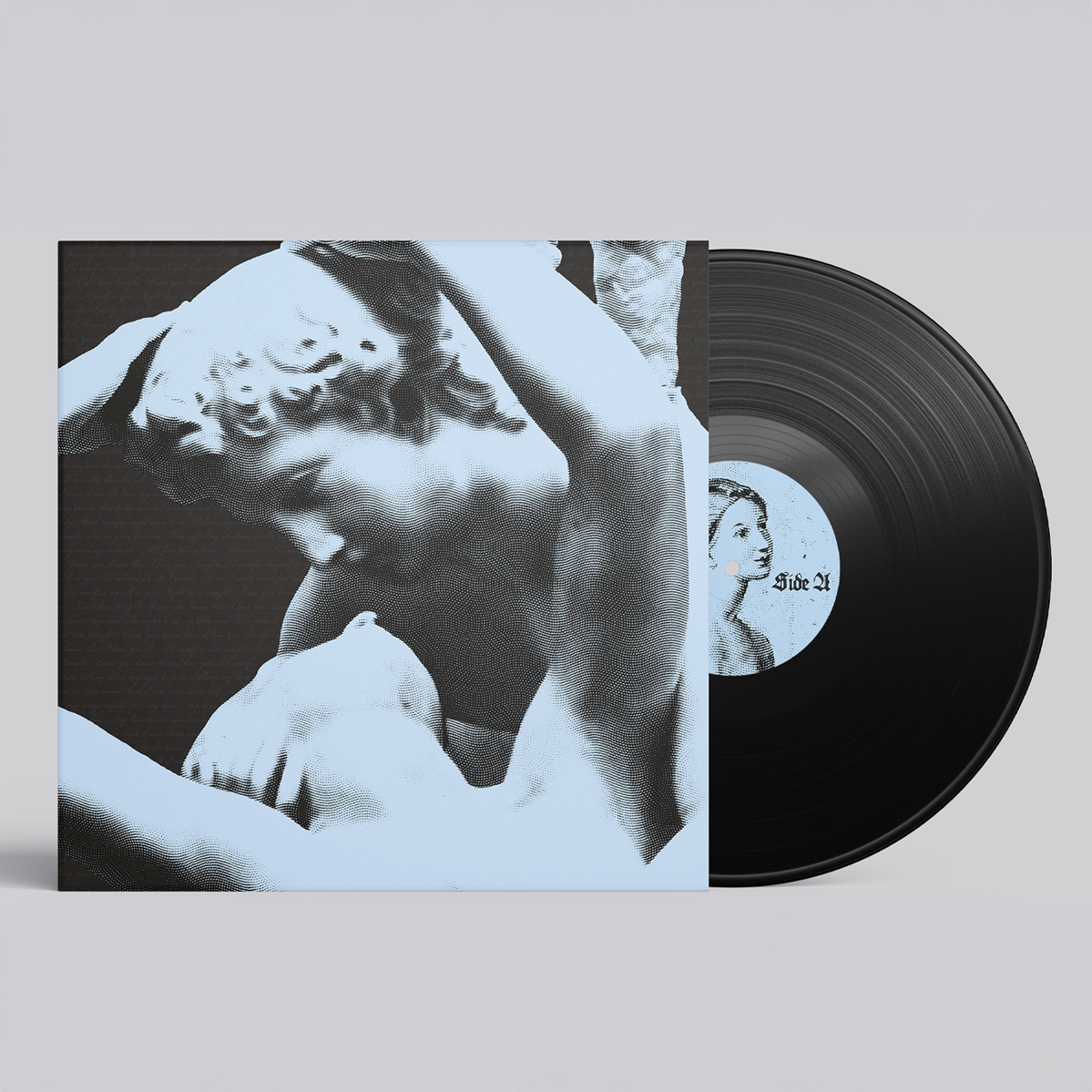
Cool tones overall are more melancholic and evoke a sense of mystery. They are also more associated with other worldliness, such as ghosts, dreamlike states, and moonlit landscapes, all of which are also associated with the goth subculture and this album.
Imagery
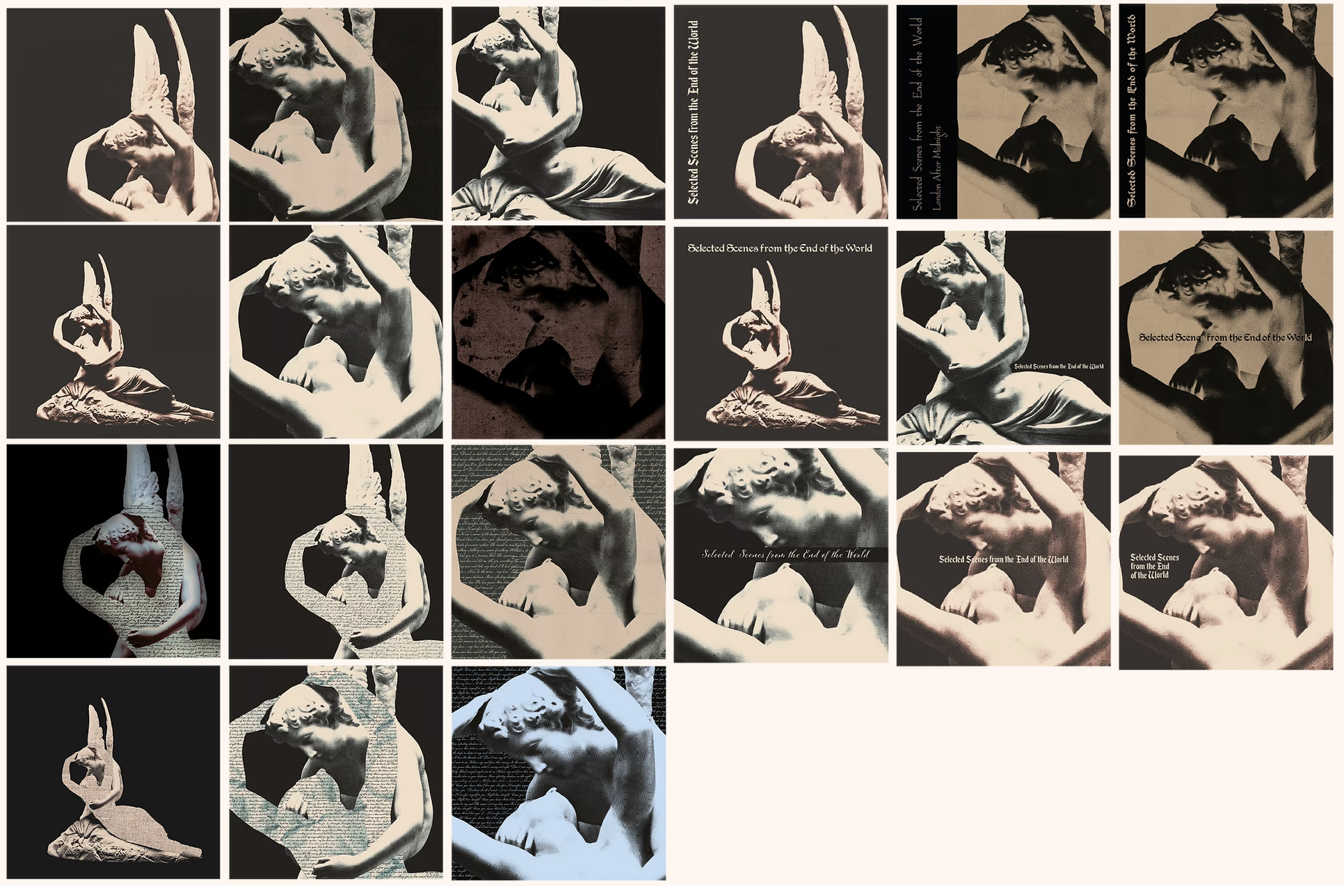
Psyche Revived by Cupid’s Kiss is a Neo Classical statue of lovers Cupid and Psyche. It follows the story of Psyche being put into deep, death like sleep by Venus, who was jealous of her beauty. Cupid finds her like this, and revives her with a kiss. Being one of the most iconic representations of romantic tragedy mixed with death and desire, I found it appropriate to use for this album. I added an engraved texture to remove the smoothness of the actual statue. The songs on the album are far from being about perfect love and an ideal world, so I wanted to get rid of the perfect look of the statue to relate to this.
Different paintings that relate to the the songs meanings are used inside the lyric book. These are given the same treatment as the image on the front cover. The lyric book is printed on blue paper and uses only black ink.
Front cover experimentation
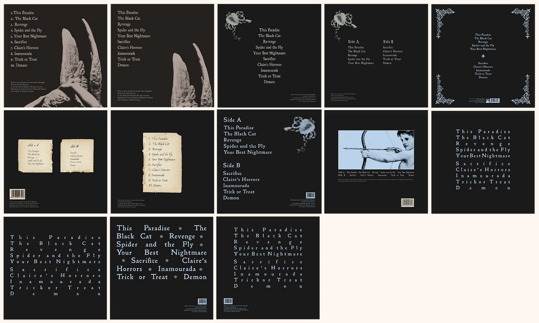
Back cover experimentation
Series design
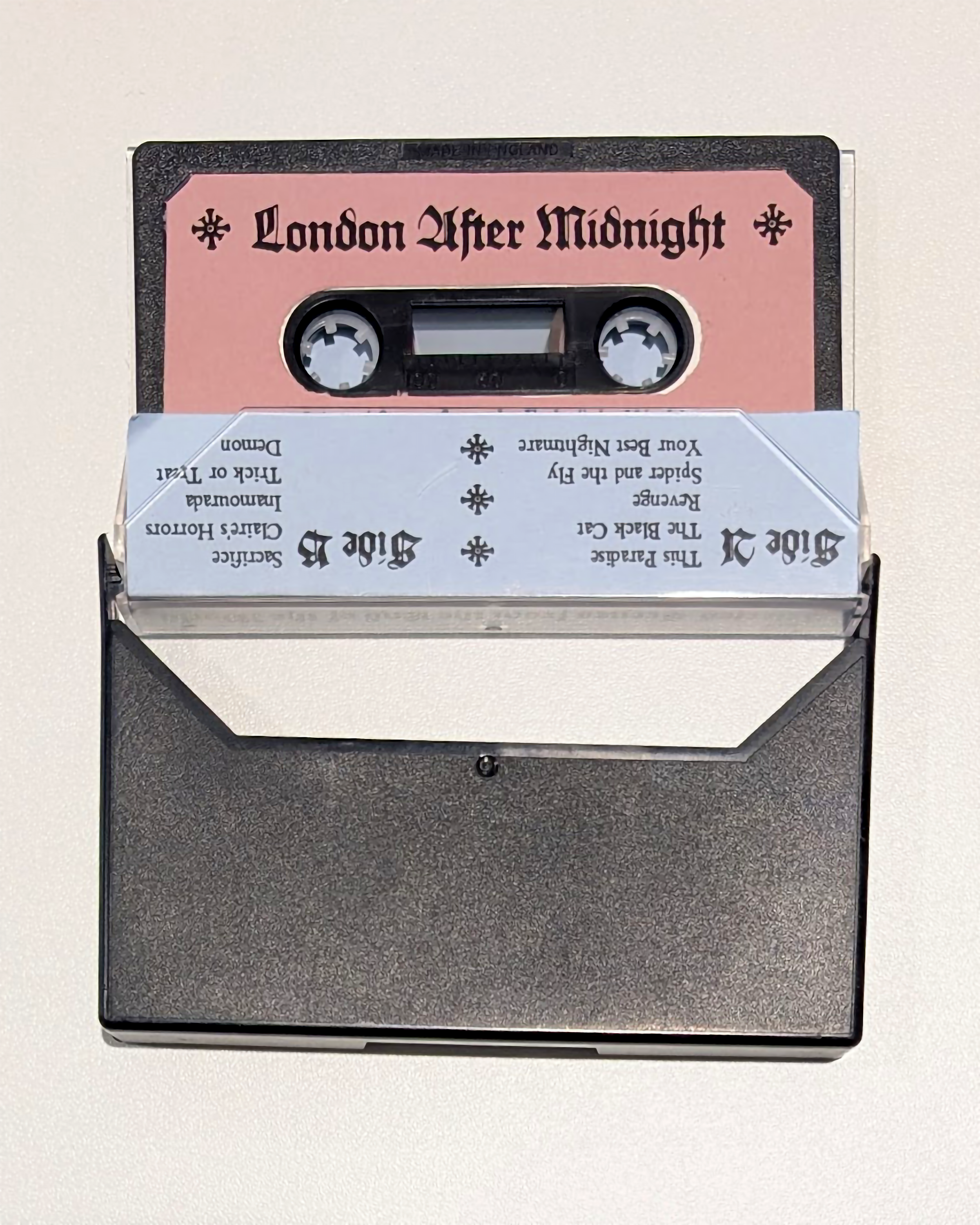
In order to create a cohesive series, I used the same colours throughout my deliverables with the exception of a pink accent colour. The accompanying lyric book pages are printed on blue paper and only uses black as it is more interesting in terms of materiality. The cassette features both the pink and blue paper with the songs on both sides A and B.