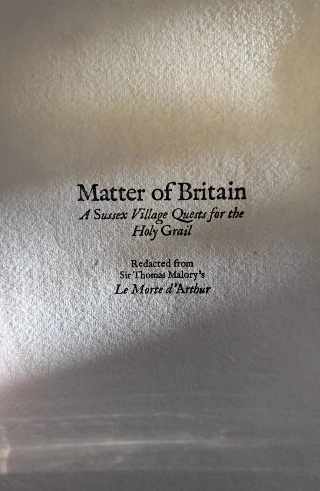
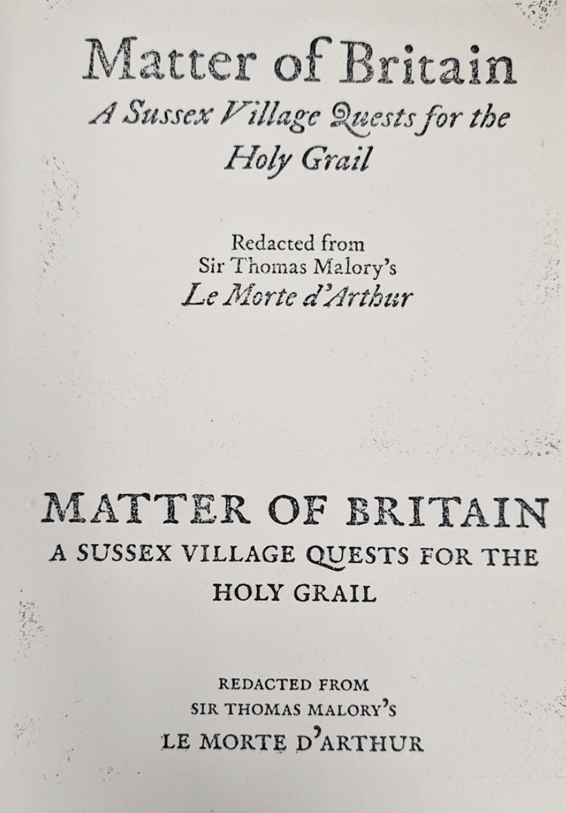
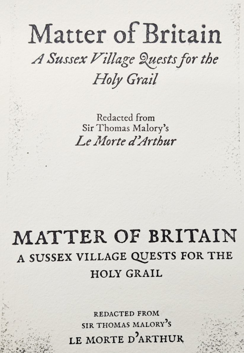
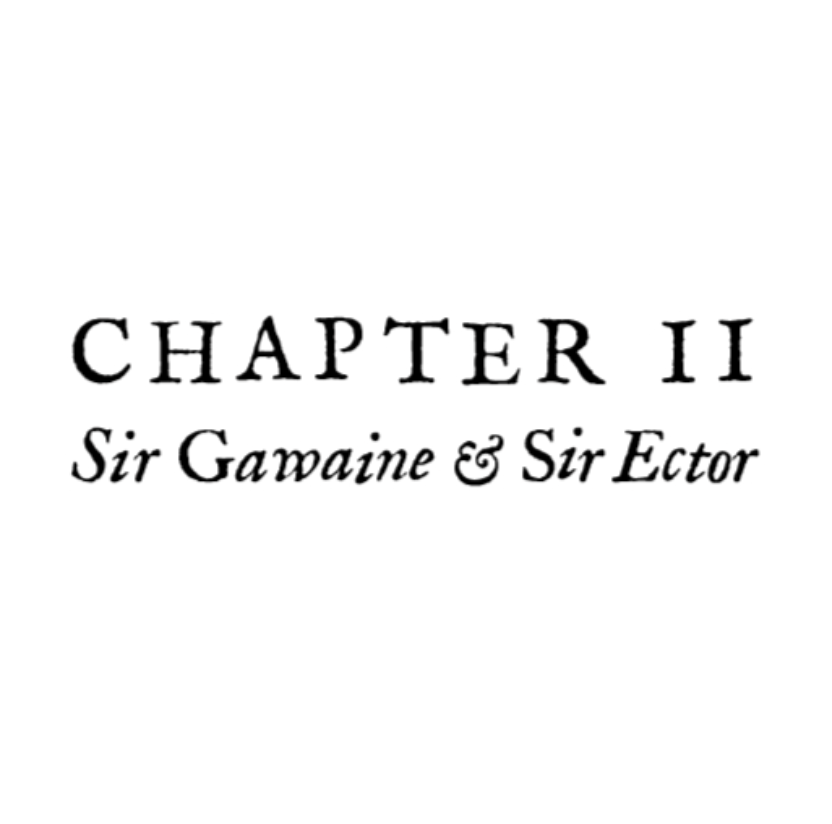
Matter of Britain
About Matter of Britain
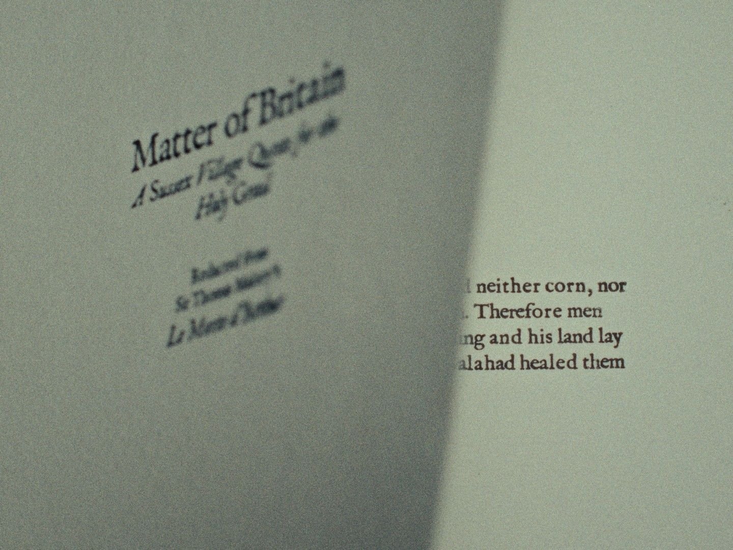
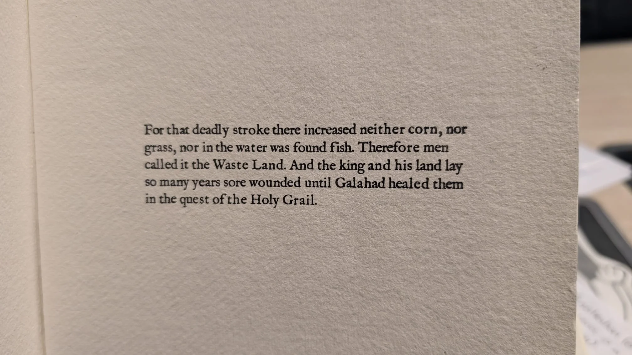
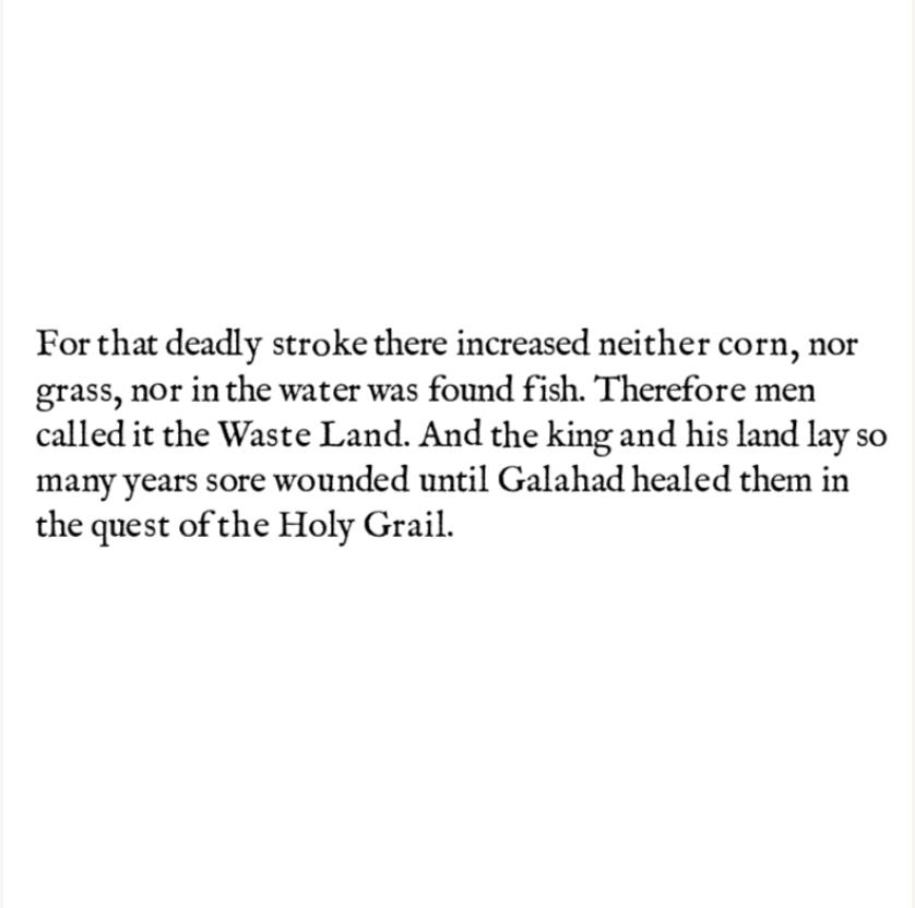
Matter of Britain is a feature film directed by Peter Treherne. The film is an Arthurian fantasy about the search for the Holy Grail in a Sussex village. Over the course of a year, the villagers search for the Holy Grail in order to heal their wasted land. Meanwhile, local farmers extract what they can from the land, and labour to make it fertile. My partner and I were to make title cards for this film.
Typography
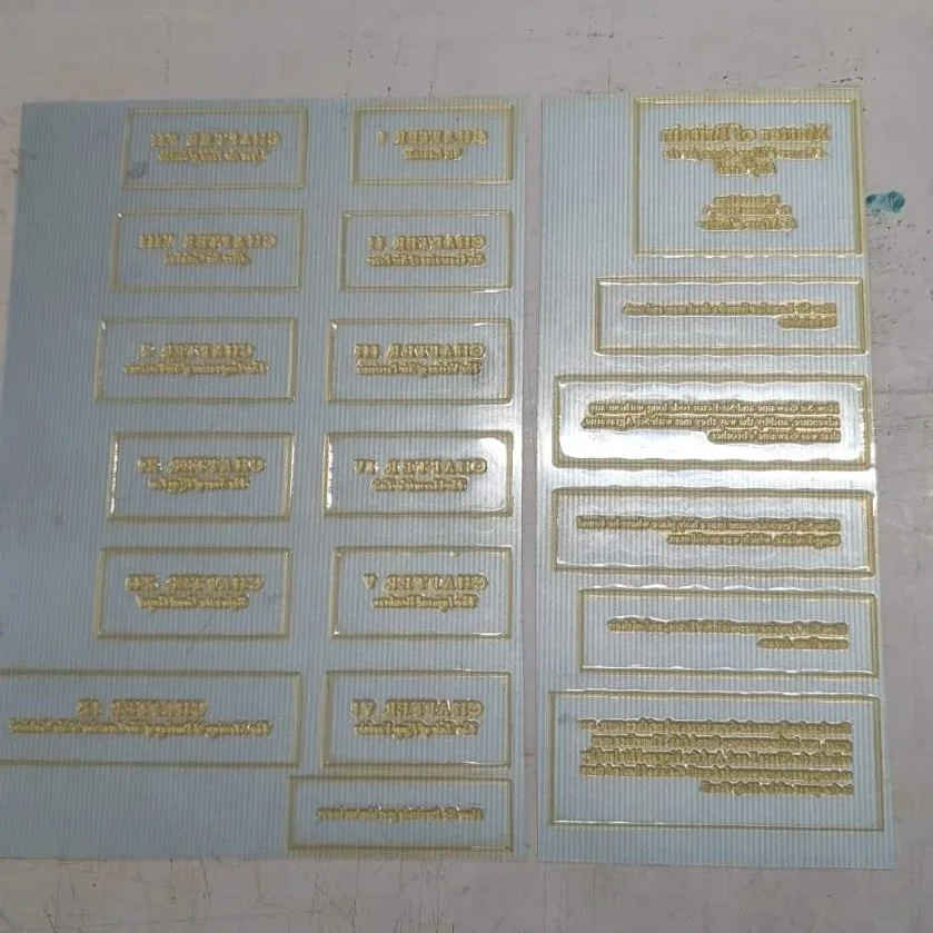
Using metal type for these title cards would have been tedious, especially for our tight deadline, which is why we used polymer plates instead. Since this was a short turnaround job, we wanted to use the method that would leave the least room for error and is relatively fast to do. Polymer plates also give a hand printed look, especially if we were to use a typeface that makes it seem as though they contain inking inconsistencies, despite being digitally made.
Early title card experimentation
We used the typeface IM FELL as it is designed to look as if it has inking inconsistencies. Things we did to make the title cards look authentic and hand printed included shifting individual letter above or below the baseline a few points in InDesign before making them into polymer plates. Some italic capital letters were make to be non-italic, reminscent of how printers often did not have full sets of type.
Card design in InDesign
Polymer plates
Printing process
A roller press was used to print the polymer plates onto textured paper. Time management was important in this process as we were dampening the paper to enhance ink bleeds. We had to wait the right amount of time for the paper to dry enough so that the ink bleed would not make text illegible, but not so dry that the ink would not bleed at all.