Low Res magazine
About Low Res
Low Res is an independent magazine all about punk design submitted as for a university module. A tribute to the designs that helped shape a movement, it covers everything from stickers to flyers to jewellery and more. It is geared towards designers interested in punk design, but is also for people who listen to punk music who want to learn more about the designs that helped shape it.
Issue 1, featured above, is about punk zines. I also designed the covers for issues 2 and 3, which are about jewellery and hairstyles.
Typography
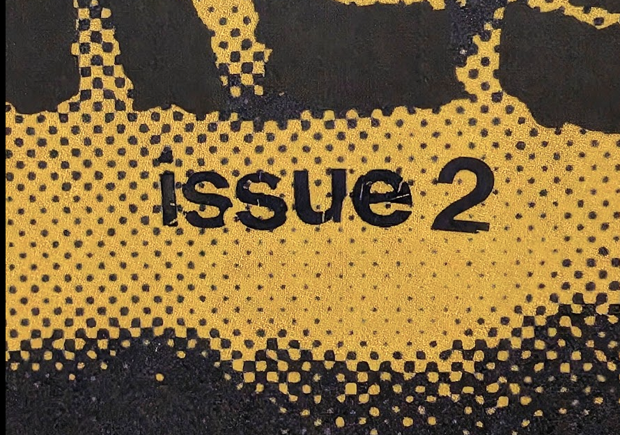
The typography in Low Res is inspired by DIY punk zines of the past. All mastheads are had drawn and are different for each issue. Body text is set in the typewriter typeface Special Elite, and headings for each article are all different. Issue numbers on the front cover and all text on the spine is in letraset to embrace imperfection.
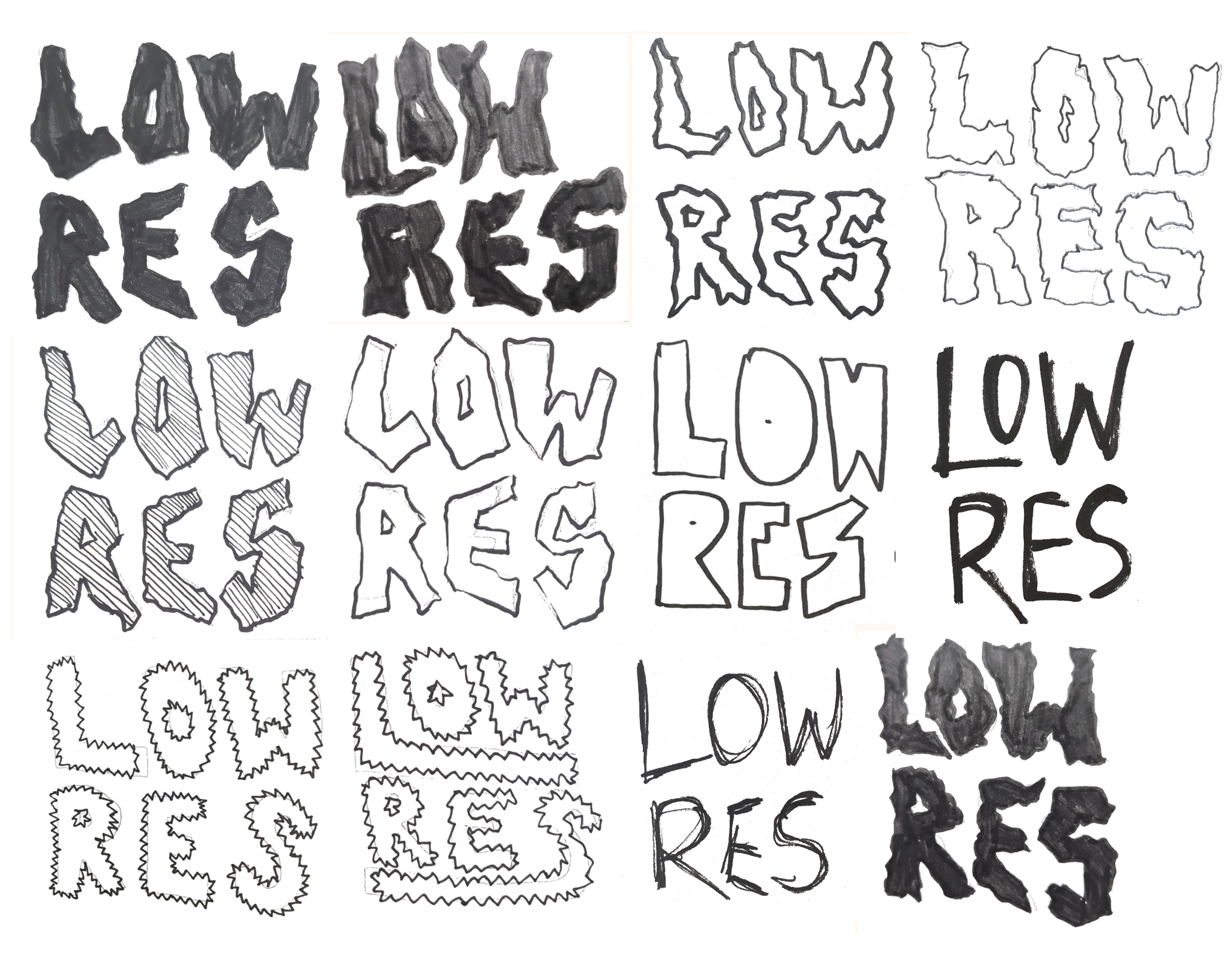
Masthead experimentation
Letraset
Colour
The covers for Low Res are all large, duotone images that feature an effect such as halftone or screen printing. This is to embrace punk's in-your-face nature, as Low Res aims to honour punk's loud, apologetic ethos. These vibrant covers also help the magazine to stand out on a shelf amongst other magazines. Inside pages feature coloured paper stock instead of printing a block of colour onto white paper to elevate the magazine's authenticity and provide a more interesting reading experience.
Layout and Grids
Low Res does not shy away from a messy, dynamic layout. Some articles have scanned in introductions and pull quotes that were written on paper, along with askew text boxes. This pays homage to zines in the past being hand cut and stuck together.
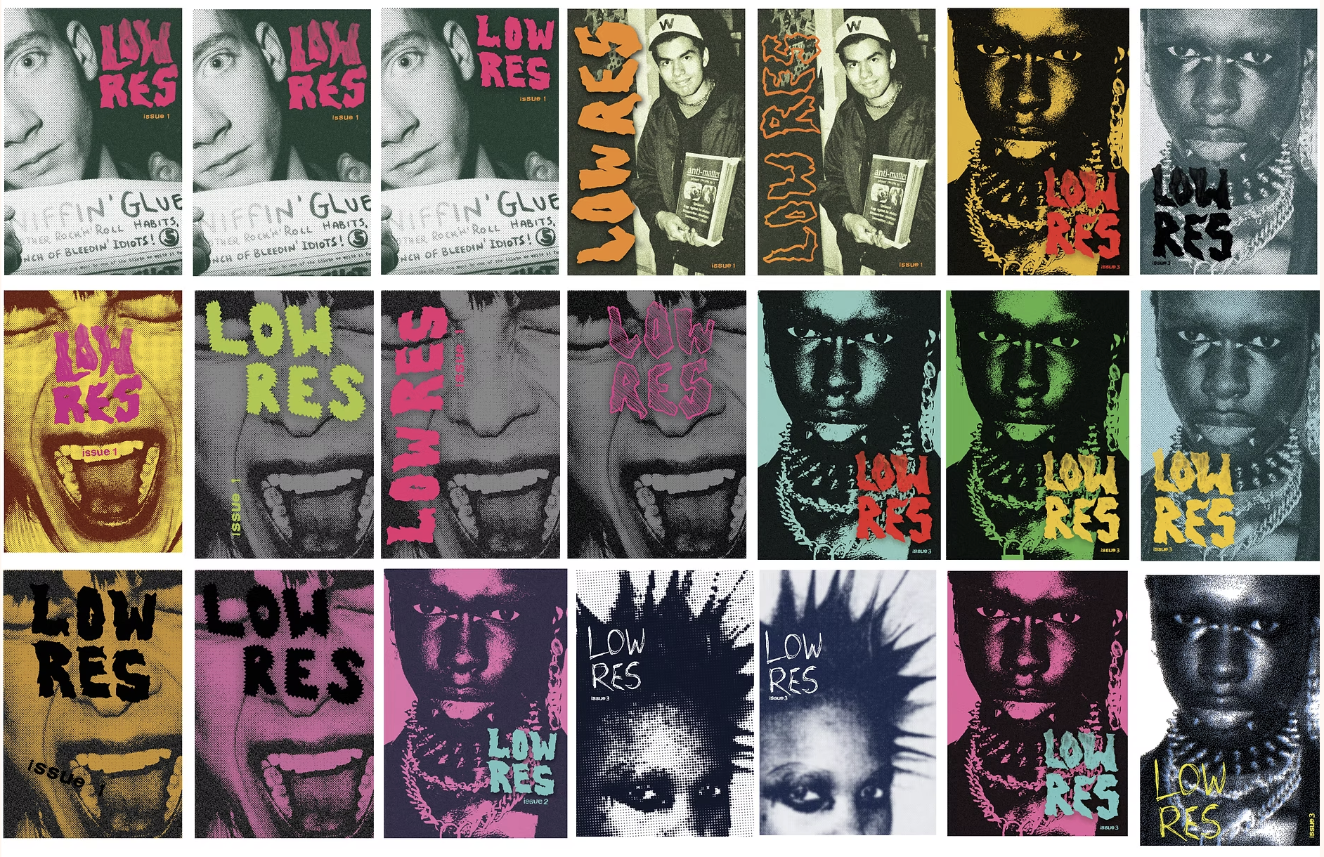
Cover experimentation