Different by Design issue 5

About Different by Design
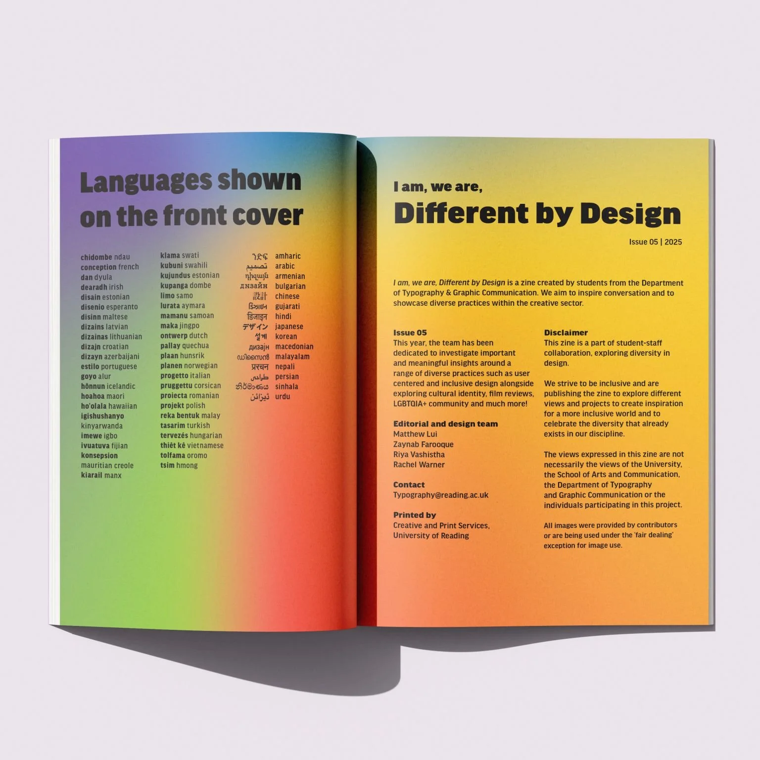
The Different by Design zine is an annual zine created by students in the Typography and Graphic Communication department at the University of Reading. I worked on the fifth issue with two other students to create a zine that showcases diversity in design, film, and art. Including pieces about user centred design, women in art, film reviews about cultural heritage, and more, we were able to cater towards a wider audience as opposed to just designers.
Artist interviews
Kira Read
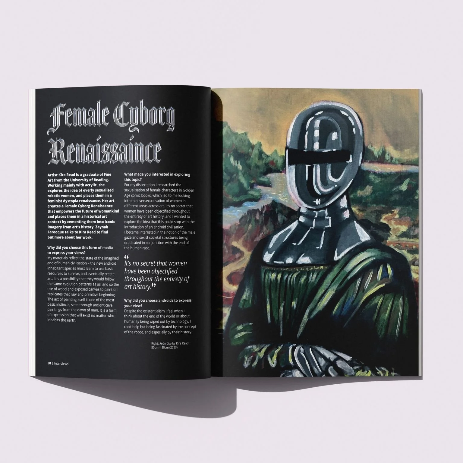
I conducted an interview with artist Kira Read about her Female Cyborg Renaissance art series. She explores the idea of overly sexualised robotic women, and places them in a feminist dystopia renaissance. This was a unique concept I had not seen before, and the way she mixes the past and her idea of the future together really intrigued me.
I was aiming to incorporate the concept of merging the past and future together through type in this interview article. Taking the cyborg theme from Kira’s work, I added a chrome effect onto blackletter. I chose blackletter because of its historic connotations

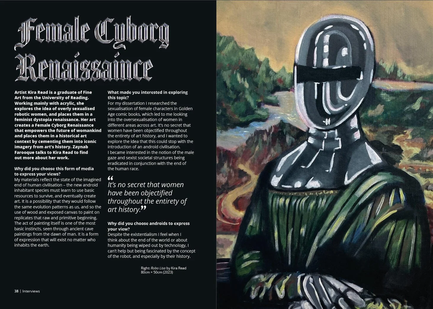
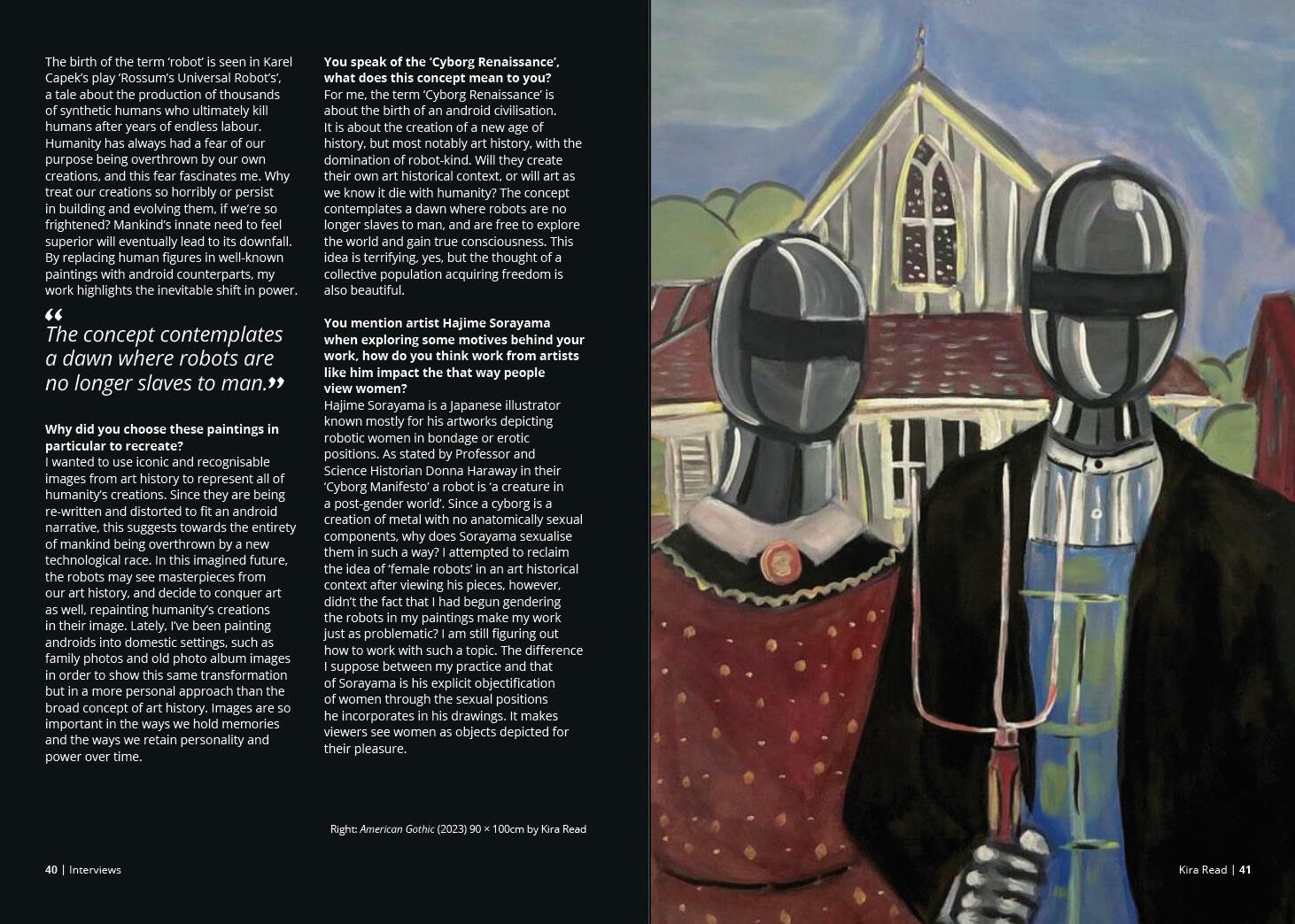
Title and spread design for Kira Read
Glora Da Silva
Artist Gloria Da Silva is British-Angolan who creates art about her Angolan identity. Creating a spread about a topic I'm unfamiliar with allowed me to research into the topic and what design elements I could use to make the spread feel in line with the topic. I drew a samakaka pattern for the background, an Angolan print prominent in textile design. I also used the colours of the Angolan flag throughout, which appear in her work.
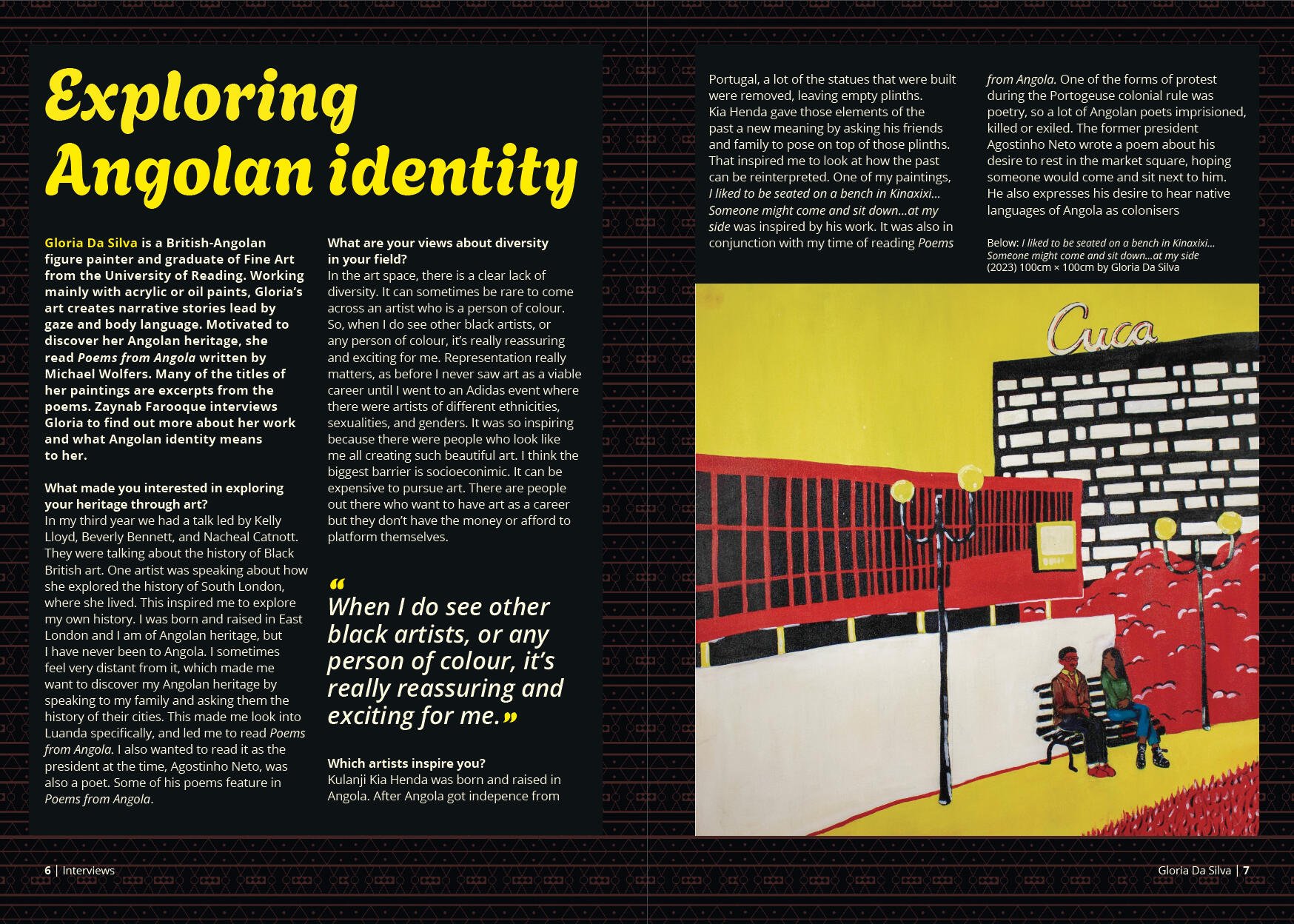
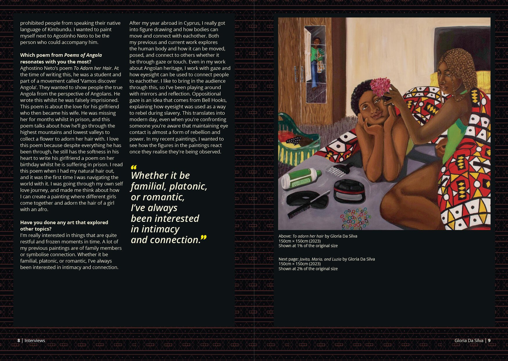
Spread design for Gloria Da Silva
Film reviews
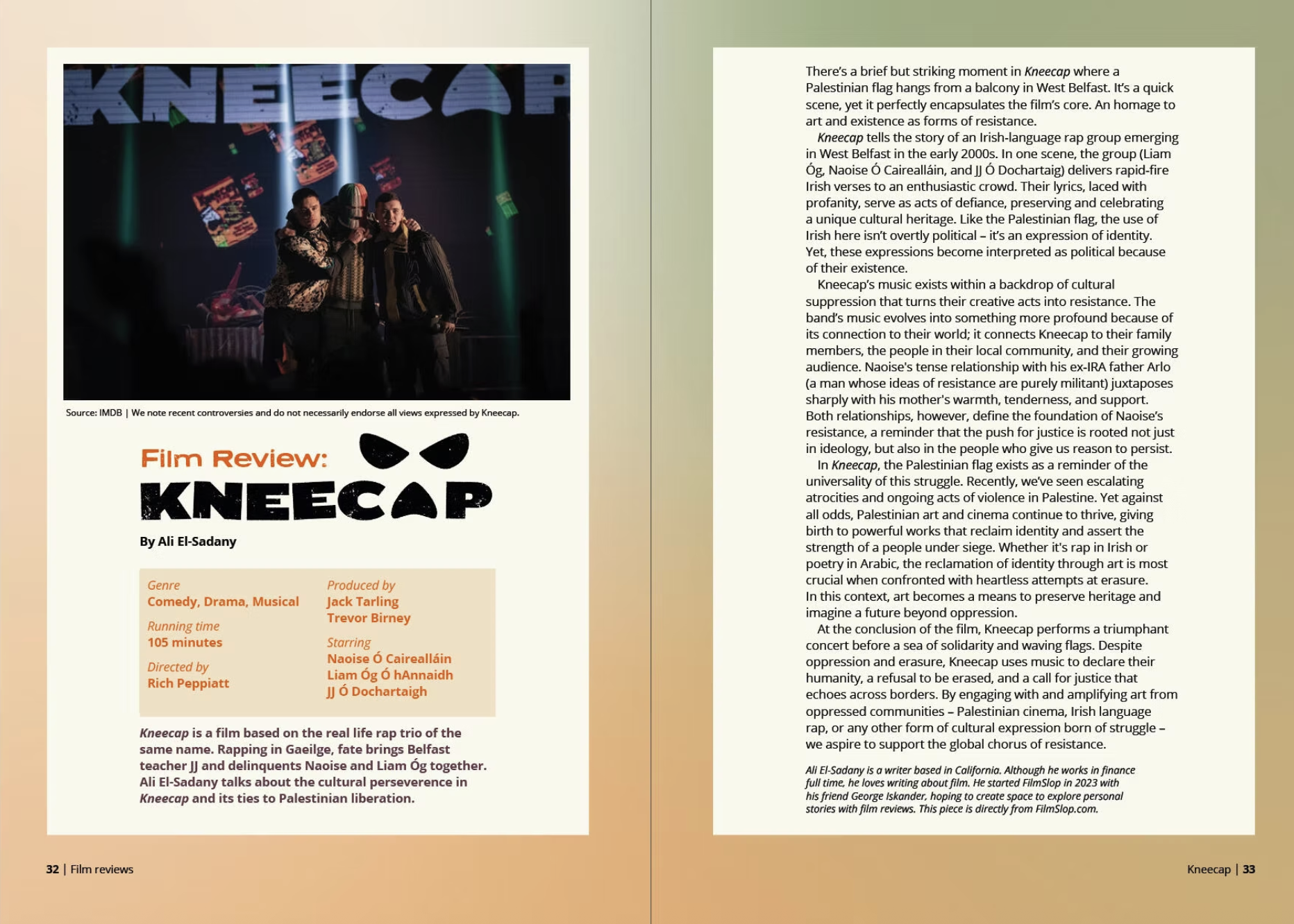
Kneecap
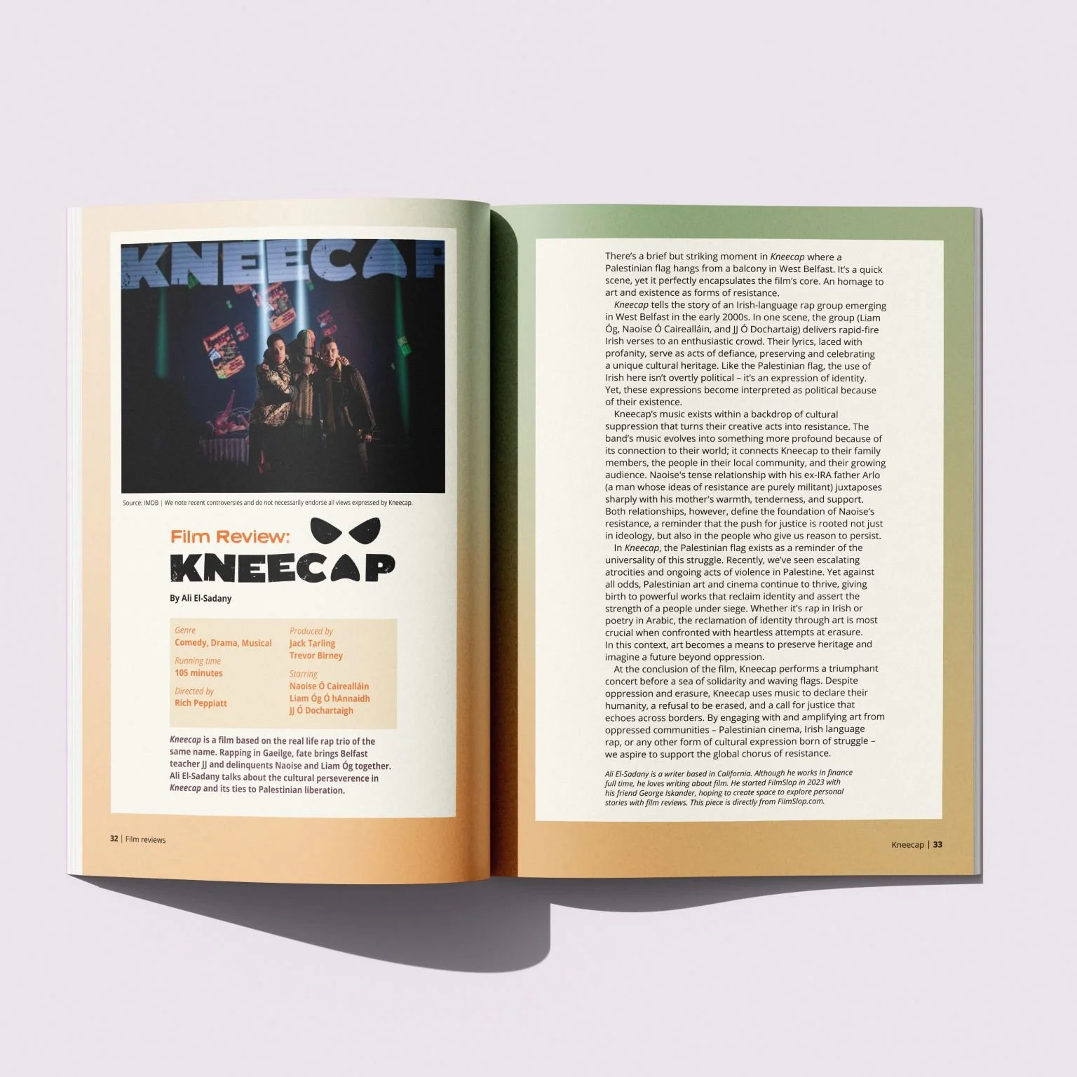
Kneecap is a film about the Irish rap trio of the same name. This film has themes of cultural preservation and identity, which was perfect for the overall theme of the zine. Since the piece talks heavily about Irish identity along with the film itself being about it too, I made a gradient with the colours of the Irish flag for the background. This made the background look more interesting, rather than just having it a solid colour from the flag. I wanted to find a typeface that was similar to Kneecap's logo so that the title would look cohesive, and ended up using Neuzon as it has the same stamped effect as the logo.
Spread design for Kneecap review
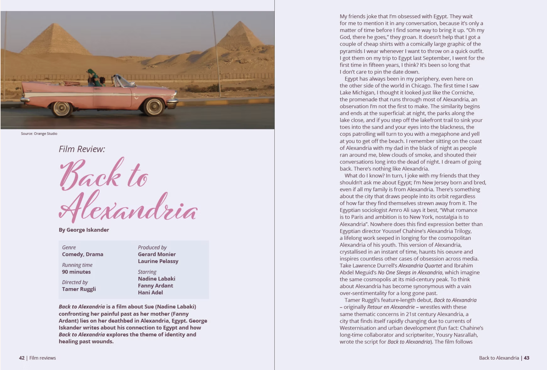
Back to Alexandria
This film is about main character Sue travelling back to Alexandria, Egypt to visit her mother on her deathbed whilst confronting her painful past. The author of this piece talks about his personal connection to Alexandria. I colour picked from the film poster to use for the background and text colour. The Arabic film poster uses a hand drawn typeface, so I wanted to find a similar Latin one to use for the zine. I ended up using Cinque Donne.
Spread design for Back to Alexandria review
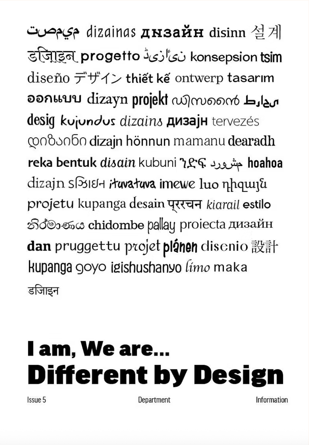
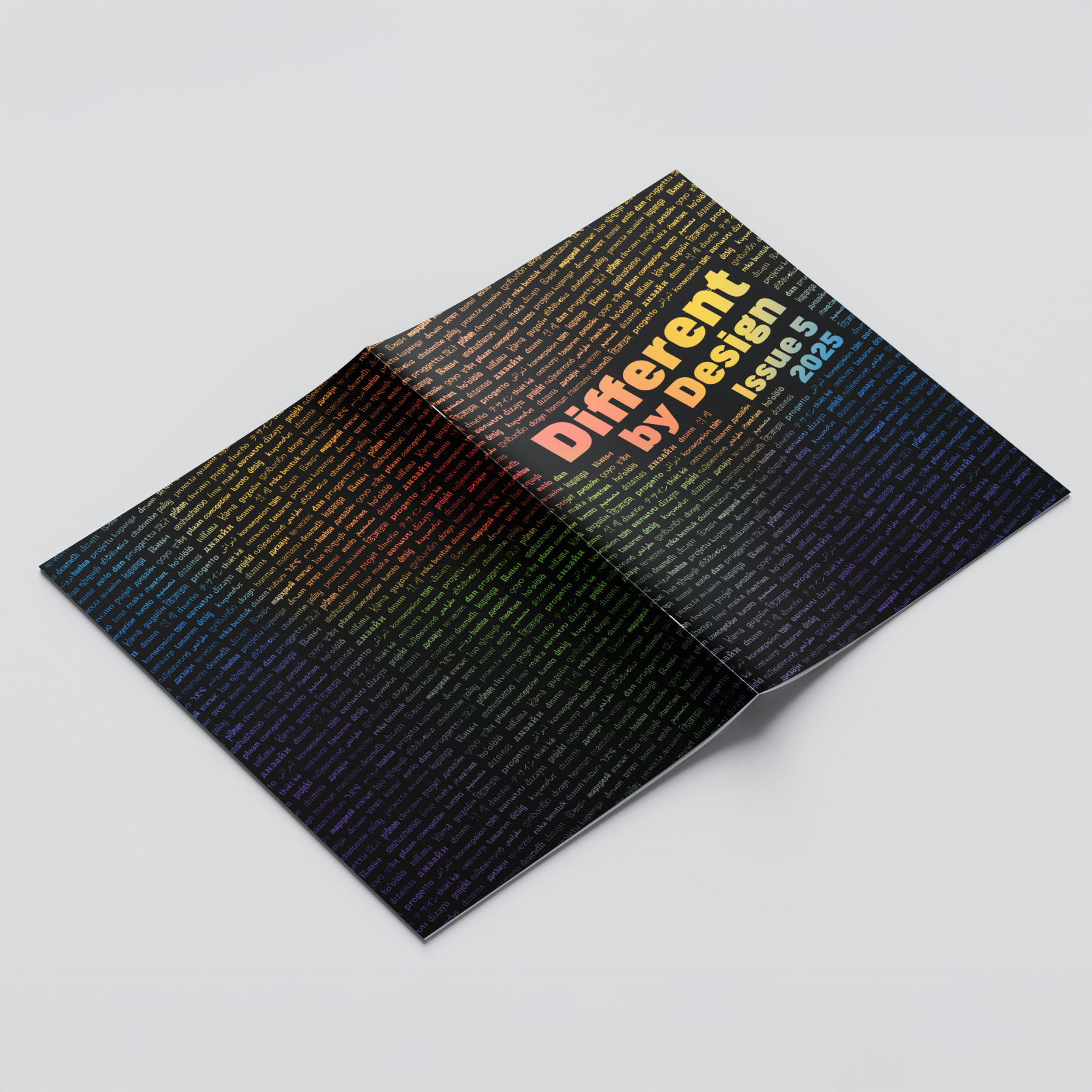
The initial idea was stacking the languages on top of each other with the title of the zine underneath in bold letters. I felt like this was quite boring and plain, no matter what colour combinations or special finishes were used. It also made it more obvious which words were bolder than the others, drawing attention to certain languages. It also left the back of the zine blank, which was quite underwhelming for a zine about celebrating diversity.
Front cover
Final cover design
In order to solve this, I tried changing up the position of the multiple languages and turning it different ways. Using Illustrator, I created a repeated pattern out of it and put it on the cover in Photoshop. This gave the cover some visual interest in terms of composition and allowed the front and back cover to seamlessly join together.